Monday, April 30, 2012

Week 4 April 30, 2012: Poster Design (2)

This is my 2nd (of 3) Paul Renner poster. For this design I also used a bleed technique as a design element. The main design element I was going for was movement and depth. I achieved the movement by adding lots of diagonal lines flowing off the page while using light gray lines to create depth. The type used is Paul Renners Futura. The focal point for this design is not intended to be the red lettering but the symbol that Renner would use on his designs randomly on his artwork.

Sunday, April 22, 2012

Week 3 April 23, 2012: Poster Design

While attending the Art Institute of Charleston one of my class projects (not sure of the class) was to pick a Type Designer and use one of their graphic type to come up with a poster design that illustrates their style while executing some of our own style as a designer. Paul Renner is known for the Futura type. It is known to me to have a clean, smooth look and feel. In my part of the design I used his quote as a design element and not something to really be read. The only thing I wanted to be clear as the focal point was the name of the designer and the type name. I added red to surround the name because red is a loud color and has a feel of urgency which helped my design a lot because of all the white space. I also love to make designs that flow off the page. It makes a design that's not much, look bigger then it is. Because of his type design, I wanted to give off a clean and not so cluttered look.  

Sunday, April 15, 2012

Week 2 April 16, 2012: Kitchen Shower Water Labels


In my next design I have created a water bottle label for a kitchen shower (Bridal Shower). Tying to make the design targeted for women, I used a feminine type of swirl pattern with a flowing type font. To keep the bridal shower labels as close to the design of a real water bottle label, I have added nutrition facts with a touch of humor as a fun creative design element. I enjoyed this project with not that many problems. The client only asked that the colors of the wedding (champagne & brown) be used.        

Saturday, April 14, 2012

Week 1 April 9, 2012: Business Logo


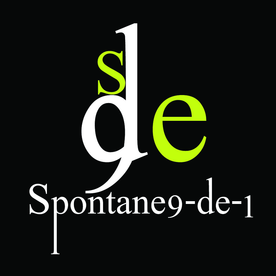
In this design I wanted to create a logo that was fairly simple and represented my business Spontane9-de-1. The name is a mixture of the words spontaneous and designs including the year I was born. I've wanted to change the design just a little to make it more appealing to the eye without overdoing it. The colors will be the same but a design element may be added to the actual logo that can stand alone (sde.)